 |
|
Component > Dialogue System > UI > Unity UI > Selector Display
Overrides the default display behavior of Selector or Proximity Selector to use a Unity UI canvas instead.
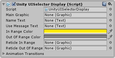
| Property | Function |
|---|---|
| Main Graphic | The main graphic control, the parent of other UI controls for the selector. (Optional) |
| Name Text | The Text UI control for the NPC's name |
| Use Message Text | The Text UI control for the use message |
| In Range Color | The color of the information labels when the target is in range |
| Out Of Range Color | The color of the information labels when the target is out of range |
| Reticle In Range | The targeting reticle image when the NPC is in range to be used |
| Reticle Out Of Range | The targeting reticle image when the NPC is selected but out of range to be used |
| Animation Transitions | Animations to use when the player selects or deselects the NPC |
This component overrides the default display provided by Selector or Proximity Selector to use a Unity UI canvas instead. You can find an example prefab in the Prefabs/Selector folder.
If you want to override the display again for a specific usable, you can add a Usable Unity UI component to it.
<< Components