Dialog with photo (UI question)
Posted: Thu May 27, 2021 9:43 am
Hi!
This is basically a Unity UI question, but since it's related to a dialog setup that I think should be common, I'm hoping you could help me here.
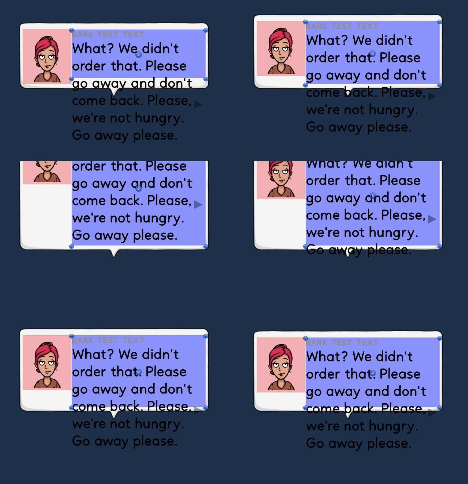
What I want is a dialog with text that fills the bubble that autoexpands, and if I have a portrait, it will take 120 pixels space, and the text will take the rest. It should have a min-height, so the photo isn't cut off when the text is short.
The arrow in the bottom left should always be in the bottom right of the box. (It indicates click to continue)
When I resize the "Text container" (the blue one) as the GIF shows, the bubble resizes correctly, but i'm not getting the text to autofit inside of that. Unity gives me a warning when I put a Content size fitter inside "Text container", and it also behaves weirdly.
This is how I set it up, which seemed logical, but it doesn't quite work:
- Bubble (Horizontal layout group, control child size: width, Child force expand: Height + Content size fitter: H: Unconstrained, B: Preferred size)
-- Portrait container (Layout element, min height: 120, preferred width: 120)
--- Portrait (Image with pos Y -10 to move it down slightly)
-- Text container (Layout element, Flexible width: 1)
--- Vertical (Vertical layout group, control child size: width+height, Child force expand: Width + Content size fitter: H: Unconstrained, B: Preferred size)
---- Name
---- Text
---- Button (Layout element: Ignore layout)
Thank you for any ideas!
