Maybe it has to do with the way they're anchored.
Here's the example scene:
AC_Test_AspectRatioFitter_2019-06-28.unitypackage
It's based on AC's 2D demo scene. To play it, you'll need to inspect AdventureCreator / 2D Demo / ManagerPackage and click Assign Managers.
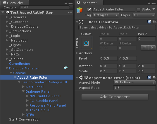
Since the 2D demo scene uses an aspect ratio of 1.5, I set the Aspect Ratio Fitter component to 1.5 also:
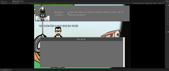
AC adds black bars to enforce the aspect ratio. When the screen is wider than 1.5, it looks like this:
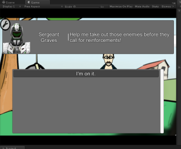
When the screen is narrower than 1.5, it looks like this:
Without the Aspect Ratio Fitter, it would look like this:
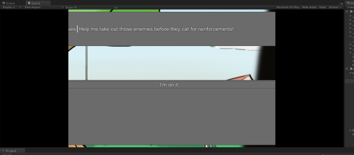
In the image above, the dialogue UI stretches all the way across the screen. Then the left and right sides are blacked out by AC's aspect ratio enforcement.
The NPC subtitle panel (there's only one in this example) is anchored from the top of the screen:
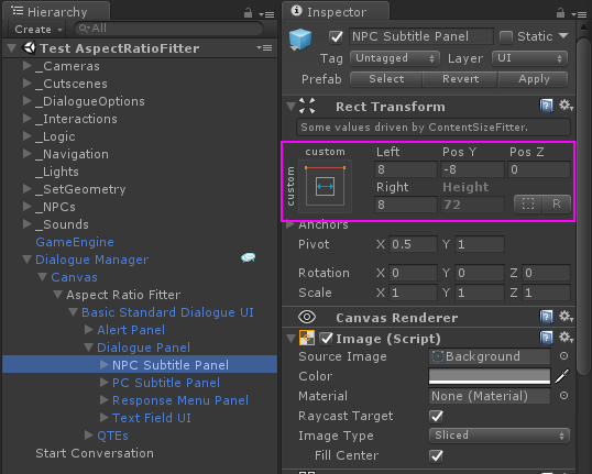
It's possible that your UI elements are anchored elsewhere, such as the center of the screen:
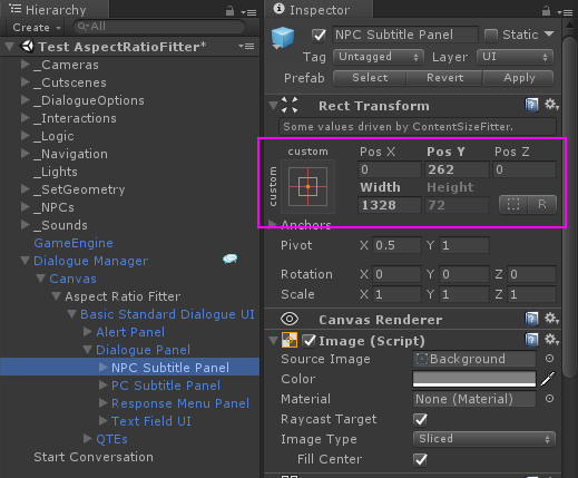
As the screen changes size or aspect ratio, this could place the UI elements not exactly where you want them.
Note also that the NPC subtitle panel in the example doesn't do any scaling. It just sticks to the top of the screen. It's always something like 80 pixels high. If the screen is only 160 pixels high, then the panel will take up half the screen vertically. If the screen is 800 pixels high, then the panel will only take up 1/10th of the screen vertically. If you don't want this behavior, try adding a Canvas Scaler to the Canvas. This adds a whole new dimension to the whole positioning thing, though, just FYI. I still go to Unity's
Designing UI for Multiple Resolutions page for guidance on that whole topic even after years of working with Unity UI.